- français
- English
Flash tutorial
Table of contents
4. Inserting a predefined button
10. Modifying the objects’ transparency
13. Create an interactive calendar (it includes buttons over an image’s region and radio buttons)
1. On the Start menu, launch Adobe Flash Professional CS5.
2. On the File menu, click New Project
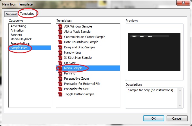
This opens the New Document dialog box. In the General tab you can check the description of the different available types of document, here is where you should select the type of document that you want to create. Selecting a concrete type of document will generate an empty document, but if you are a beginner it should be useful to select the Templates tab. Within the Templates menu you can check a preview and a description of the different templates from different categories, you can choose one of them as a starting point and once it is opened you will find some simple instructions to build your Flash document from that template.
Note: Unless you have already click the 'don't show again' check box, once you open Adobe Flash Professional CS5 you will see a menu where you can directly select these options or access to some tutorials.
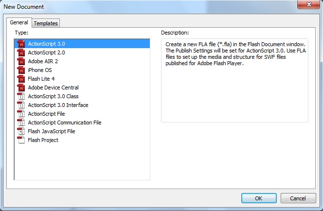
3. In the New Document dialog box, the ActionScript 3.0 file type is selected by default. If ActionScript 3.0 is not selected, select it now. Click OK.
Next you'll configure the aspect of the background of your Flash document. Here we will simply choose the size and the color of your Stage.
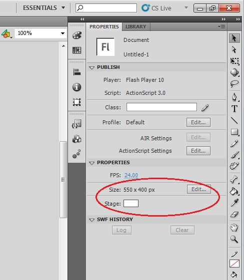
1. Click the Properties tab in the upper right side of the user interface to view the Property inspector, which displays the Stage properties for the file when no other objects are selected.
2. The Size section displays the current Stage size setting as 550 × 400 pixels. Click Edit button to configure the document settings.
This opens the Document Settings dialog box.
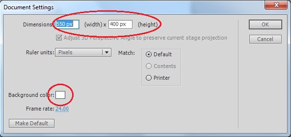
3. Configure the dimensions of your Stage. Let's select for example the dimensions of an iPhone screen, i.e. 320 x 480 pixels.
4. Configure the background color. Click on the white square and a color picker will appear. Let's choose a black background and click OK to apply the changes.
Now we have our Stage configured as a smart device screen and we are ready to add elements on it.
Now we are going to insert an image into our document to create a screen different from the background in order to illustrate a screen change on user interaction.
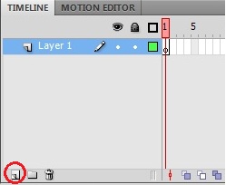
1. Click the New Layer button (page icon) in the lower left of the Timeline panel.
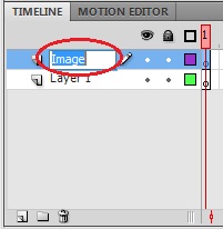
2. Double-click on the name of the new layer (Layer 2) to rename it. We are going to name it as Image.
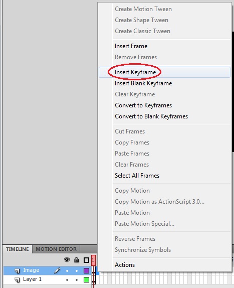
3. As we don't want to show this image from the beginning we should place it in a Keyframe located in a Frame different from the first one. Right-click on Frame 2 and select Insert Keyframe.
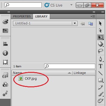
4. Drag and drop in the stage the JPG image provided with this tutorial, "CKP.jpg".
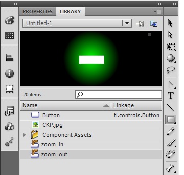
Note: Once you've done this the image will be imported to the library of your document. Check it out by clicking in the Library tab in the upper right side of the user interface. As you import elements to your document they will be accessible from your library and so you can easily insert new instances of these components into the Stage.
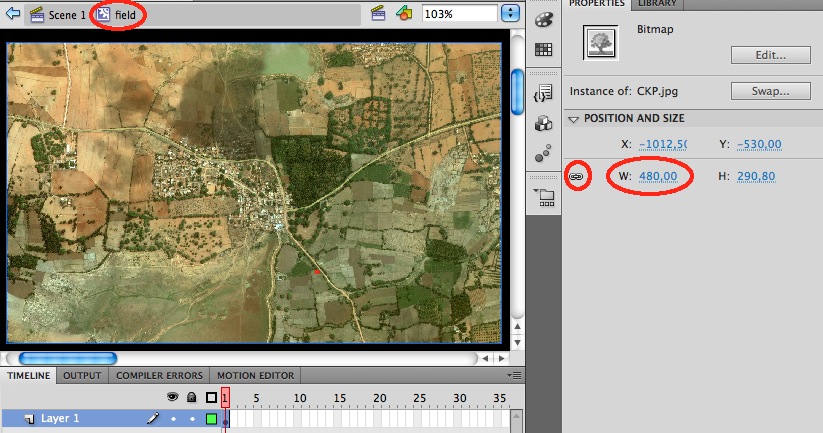
5. The imported image doesn't fit into the screen, thus we should resize it. Click the Properties tab and having the image selected you will see its dimension.
6. Click the chain symbol at the right side of the size properties in order to maintain the relation between width and height.
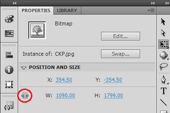
7. Set the width of the image to fit in the screen, i.e. set its width value to 480 pixels.
8. Center the image in the screen and align it in the left (we will use the extra space in the right side to place some buttons). As you approach the image to the screen's borders you will see doted straight lines to help you positioning the image.
4. Inserting a predefined button
We need some interactive element in our screen which allows the screen change to show the image inserted in last step. To do so we are going insert a clickable button.
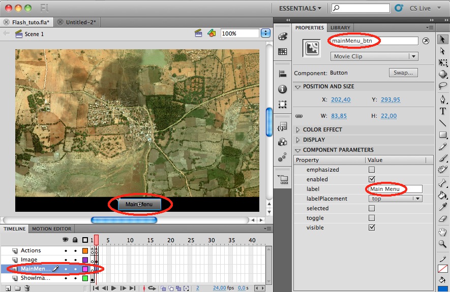
1. As this button will be visible from the beginning it’s logical to place it in the first layer. Thus rename Layer 1 to ShowImage_btn.
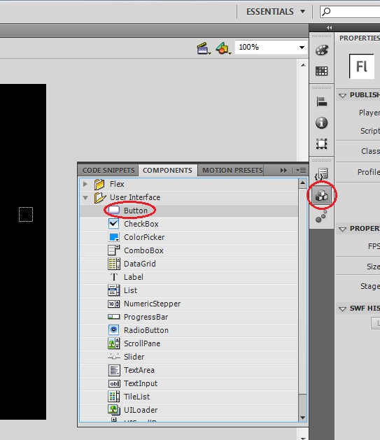
2. Open the Components panel (Window > Components or clicking components button) and drag a button component from the UI Components folder to the Stage.
3. While the Button component still selected, open the Property inspector and locate the text field at the top named <Instance Name>. Enter the name for the button instance: shIm_btn. By naming the button instance, you'll be able to reference it by name using the ActionScript you'll add to the project.
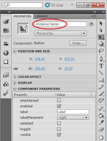
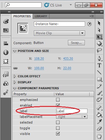
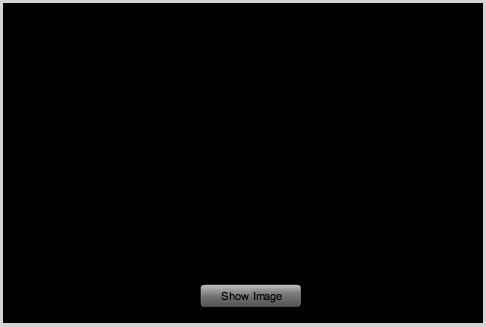
4. To update the text label of the button that is displayed on the Stage, enter the text 'Show Image' into the label field in the Component Parameters area in the Properties panel. It is purely visual and does not affect the performance of the code.
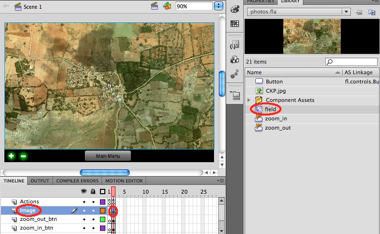
Your screen should look now as the following image:
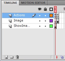
5. It's considered best practice to create a layer named actions at the top of the layer stack, dedicated to holding the ActionScript code. Thus we are going to proceed in this way, create a new layer in the top of the stack and name it Actions.
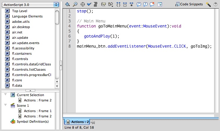
6. Now that you've created a layer to place your scripts, you can add keyframes to the actions layer to associate the ActionScript code with specific frames. First let's configure our first frame, which we will call from now on 'Main Menu'. Right-click Frame 1 of Actions layer and select Insert Keyframe in the pop-up menu. Notice that an empty, blank keyframe appears (you can tell that the new keyframe doesn't contain any graphics because the dot icon for the keyframe is hollow, rather than displaying a solid color). (Notice that for this case, as we are using Frame 1, this step is unnecessary because Frame 1 is always a keyframe).
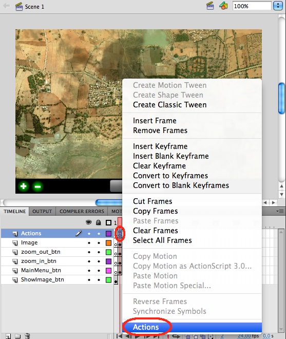
7. By now our Main Menu only contains a button, thus basically the action that we should configure for this frame is the action on pressing the button. Select the new keyframe with the Selection tool. Open the Actions panel by Window > Actions or right-click on the keyframe and select Actions in the pop-up menu (or press F9 while having the keyframe selected). The Actions panel contains the Script window where you have to type the following action:
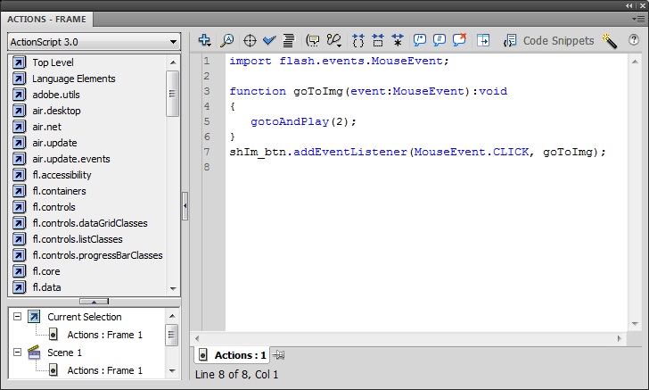
Note: After typing the line of ActionScript code in the Script window, you'll notice that a little "a" icon appears above the keyframe in the actions layer of the Timeline. This indicates that the keyframe contains a frame script (also known as an action).
8. Take a few moments to read through the code. Notice that the second line begins by declaring a function named goToImg. The last line of code uses the addEventListener method, which registers the function as an "event listener" for the button's "click" event. The translation of this code essentially says: "When a user clicks the button named shIm_btn, run the function named goToImg. When the goToImgfunction runs, it instructs the playhead to jump to Frame 2 of the Timeline and begin playing the frames."
This is the standard format used when writing ActionScript 3; one section checks for user interactivity (such as a mouse click) and that triggers another function to respond to timing cues from objects in Flash Player. In this case, the event handler function instructs Flash Player to move to Frame 2 and start playing the Timeline again. (You'll use a similar syntax of creating an event handler function and assigning it to a button instance any time you create an interactive button in Flash.)
Tip: You can use the Code Snippets panel as a shortcut when adding events to buttons.
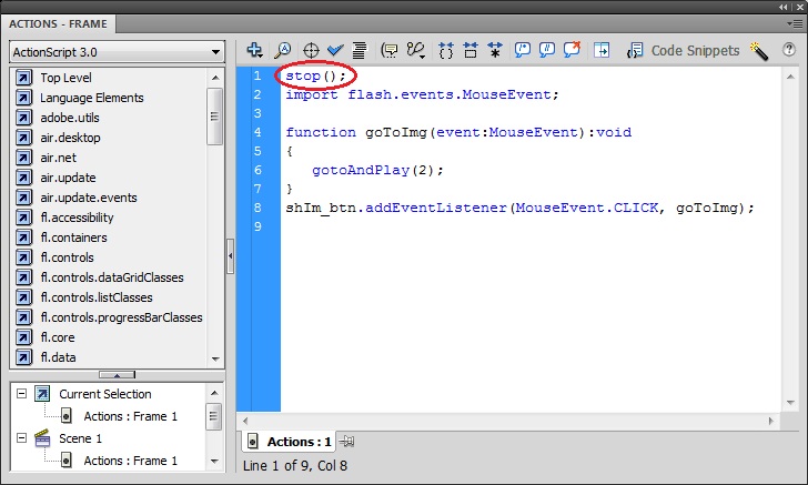
9. Basicaly Flash has been designed to create animations. Thus, when you run your application it will play what you have positioned in the timeline and once it reachs the last frame containing some element it will loop to the first frame iteratively. Therefore, knowing that we want to implement an user interface, we need to indicate Flash to stop in a certain frame and wait until next user interaction. To stop in our Main Menu select the frame where it is placed (Frame 1), open the Actions panel and add to the previous script the stop() action.
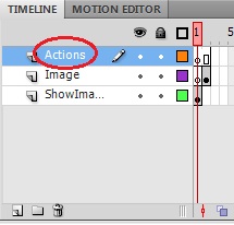
10. Now we need to stop also the execution in the Image frame. Create a keyframe in Frame 2 of Actions layer, and add the stop() instruction to its Script. Your Time line should looks as follows:
11. Finally, in order to make our application functional, repeat what you have learned in the previous steps to add a button in the Image screen to enable coming back to the Main Menu (remember: create a new layer, rename it, insert a keyframe in Frame 2 and insert a button on it), add into the Script of Actions layer associated to Frame 2 the definition of a function to go to Main Menu and associate it to the button you have just created.
Instead of using a predefined button you may want to design your own buttons. In this section we are going to create two different buttons to zoom in and to zoom out in the field image.
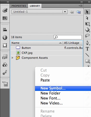
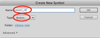
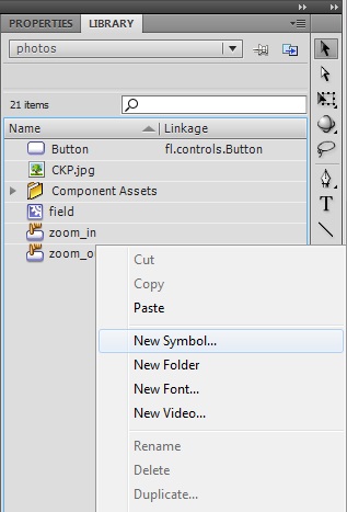
1. Select the Library tab, right-click in an empty area of the items list panel and select New Symbol…
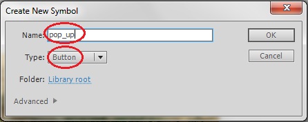
2. Configure the name and the type of symbol in the Create New Symbol pop-up menu.
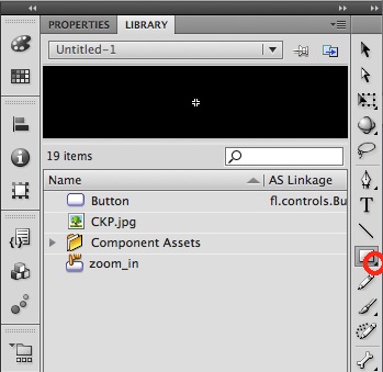
3. Double-click the zoom_in symbol that you have just created in the items list panel to enter into the stage of that symbol.
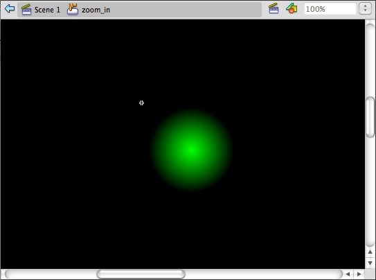
4. We are going to define the shape of the button as a circle. To do this, click in the lower right corner of the Rectangle Tool to display the different shape tools menu and then select the Oval Tool.
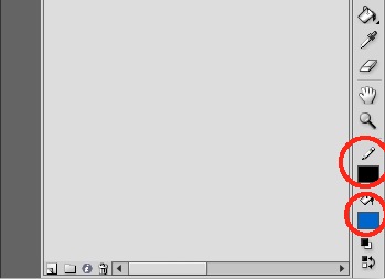
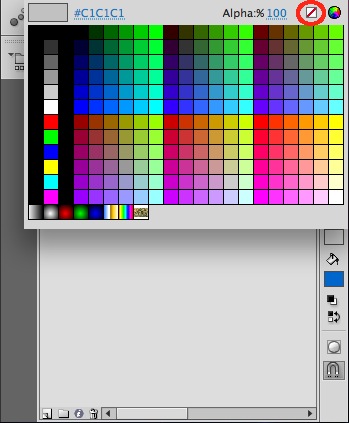
5. We also need to define the color of the button. To define the contour color click on Stroke Color and to define an empty contour then select the white square with the red diagonal line. And to define the color of the button, click on Fill Color and select a color in the color-picker pop-up menu.
6. Once we have defined the shape and the color of the button we can draw it. To draw a circle, maintain ‘shift’ key pressed (to constrain the oval shape to a circle), click in the stage and drag the mouse pointer to define the circle.
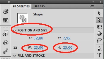
7. We should set the dimensions of the button in order to fit in the desired area of the screen. Set the width and the height of the circle to 25 pixels.
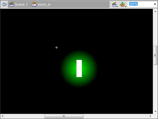
8. We should include some image over the button to represent its functionality. We are going to draw a ‘plus’ symbol by means of two rectangles. Click in the lower right corner of the Oval Tool to display the different shape tools menu and then select the Rectangle Tool. To define a color of the rectangle different from the button’s color, click on Fill Color and select a color in the color-picker pop-up menu. Drag the mouse pointer to define a rectangle.
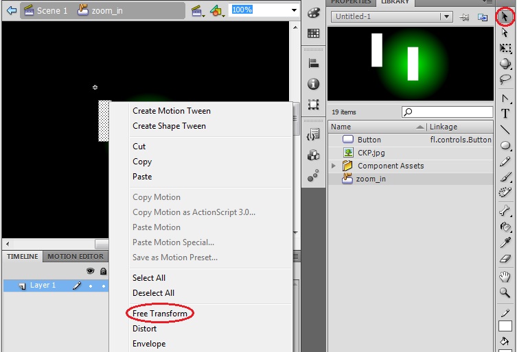
9. To draw a symmetric ‘plus’ symbol let’s copy, paste and rotate the rectangle that we have just define. Choose the Selection tool, select the rectangle, copy and paste it, right click in the new rectangle and select the Free Transform tool. Move the mouse over a corner of the rectangle until the rotation mouse pointer appears, rotate the rectangle 90º and move it over the previously crated rectangle to form a plus symbol.

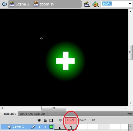
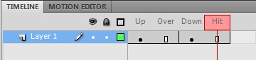
10. A button has four states: Up, Over, down and Hit. We have configured just the main one, the Up state. In order to configure the Over state to maintain the same drawing of the button, right click in the Over frame and select Insert Frame.
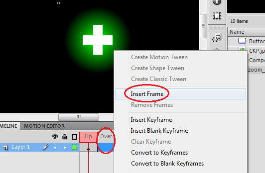
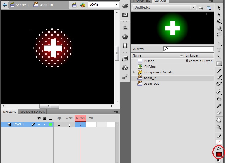
11. To configure a different aspect of the button for the Down and Hit states. Right click in the Down frame and select Insert Keyframe, choose the Selection tool, select only the circle, click on Fill Color and select a different color.

12.In order to configure the Hit state to maintain the same drawing of the button, right click in the Hit frame and select Insert Frame.
Now the button has all its states configured and it is capable to reproduce these state changes during the simulation.
13. Finally, repeat the previous steps to create the zoom out button with a ‘minus’ sign.
Tip: You can check the properties of zoom_in button to create a zoom_out button with the same dimensions.
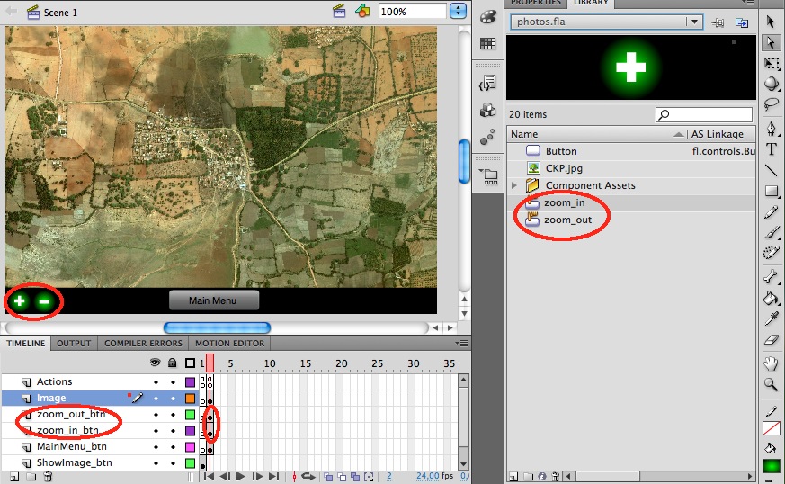
14. As final step, create two new layers to insert each button in the second frame, which is the one corresponding to the map screen. Remember to Insert Keyframe on it, and then drag and drop the buttons from the library into the stage. And don’t forget to set the Instance Name of each element to be able to use them in the action script; we will use ‘zoom_in’ and ‘zoom_out’ as instance names in following sections.
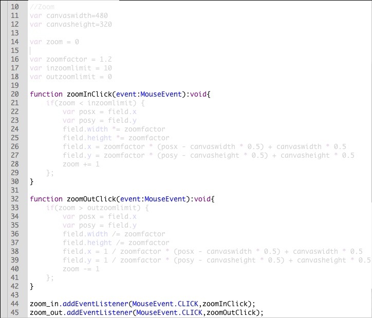
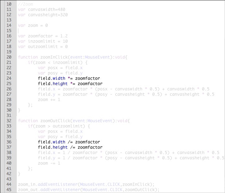
In this section we are going to implement the zoom in and zoom out actions. In fact, we are going to simulate the zoom action by changing the size of the image displayed in the screen.
1. As we will act on the field image, we should define it as an interactive element in our library, i.e. we should crate a Movie Clip object and assign the field image to it. Select the Library tab, right click in an empty area of the items list panel, select New Symbol… and configure the name and type of symbol in the pop-up menu. Include the field image into its stage, change its size to fit in the screen and finally remove the field image from the Image frame and substitute it by the field Movie Clip. Don’t forget to set its Instance Name; we will use ‘filed’ as instance name in following sections.
2. Open the Actions panel associated to the second frame of the Actions layer and write the following code in the Script window.
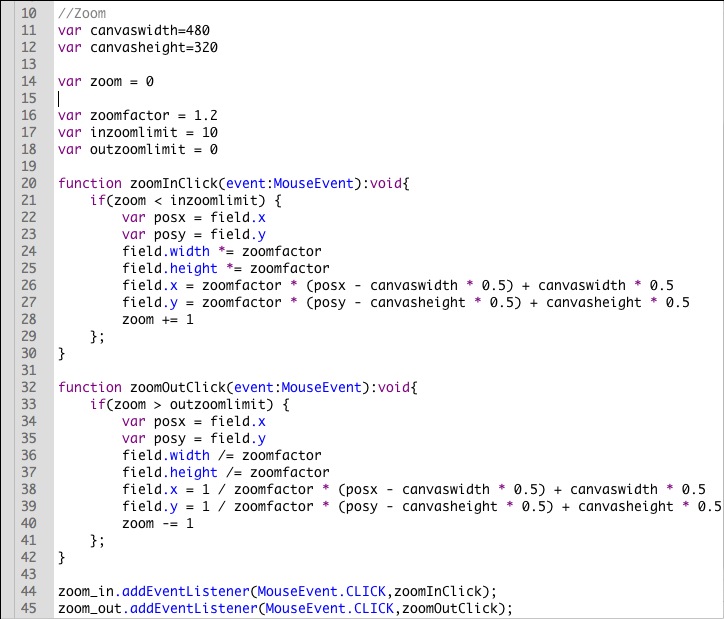
3. In the same way as we have already done in the creation of previous buttons we define a function (zoomInClick and zoomOutClick) which will be executed when we click the button.
Note: This time we don’t need to import the MouseEvent library because we have already done this in the Actions of first frame and every application will start the execution always in the first frame.
4. The first lines will create the variables that we will use in the function’s body.
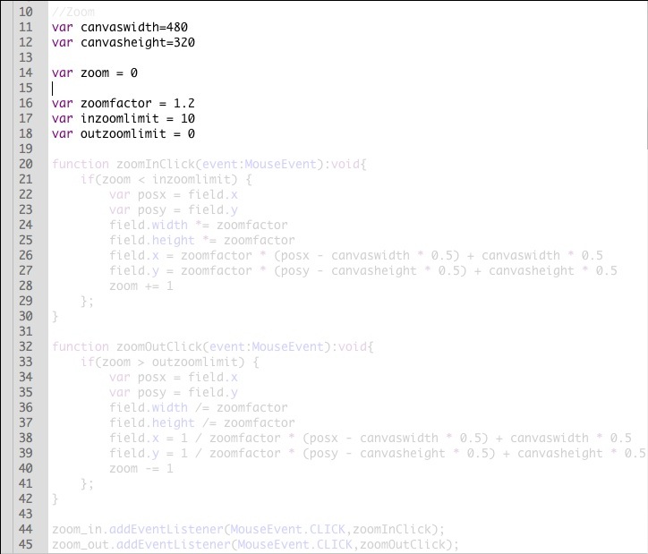
We will use screen’s width and height to maintain the image centered into the screen (canvaswidth and canvasheight). We will perform the zoom according to certain factor (zoomfactor). And we will use a counter (zoom) in order to limit how much we can zoom in or out (inzoomlimit and outzoomlimit).
5. Take a look to which lines implement the limitation of the zoom. Take some time to understand how to implement this using ActionScript 3.0
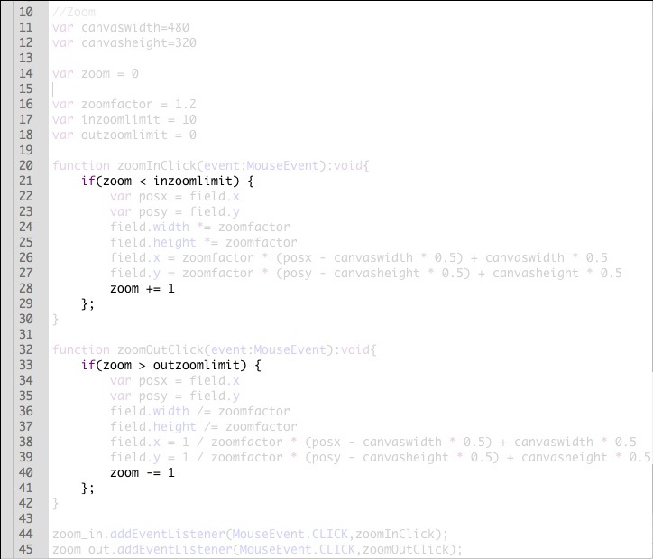
6. Take a look to which lines are needed to implement the repositioning of the image that maintains the image centered into the screen. Take some time to understand how to implement this using ActionScript 3.0
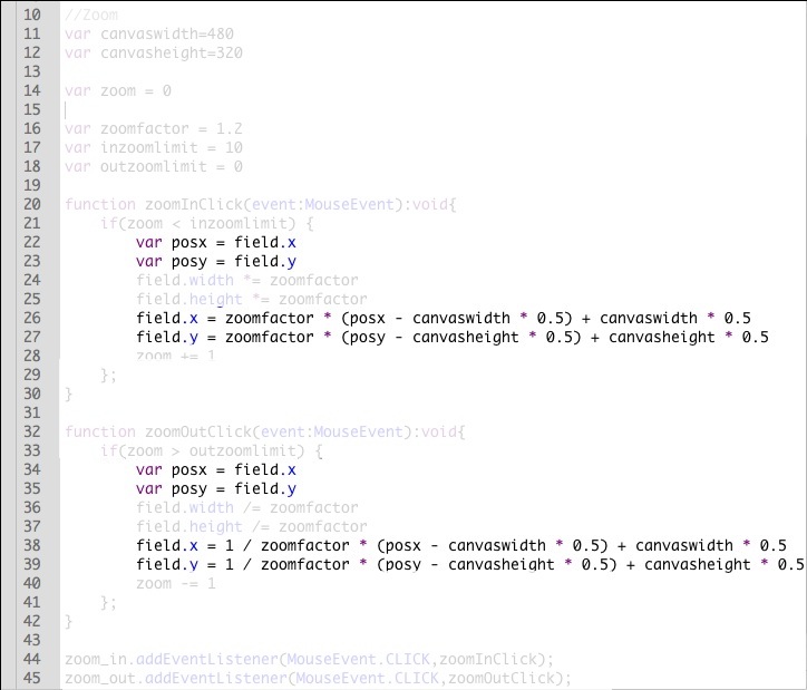
7. Finally, Take a look to which lines are needed to implement the rescaling of the image that emulates the zoom in and out actions. Take some time to understand how to implement this using ActionScript 3.0
Tip: Here we are directly giving to you the pieces of ActionScript’s code that you need to use in order to implement the features presented within this tutorial. But if you need to implement different features for your application, it could be interesting to use the Code Snippets provided by Adobe Flash. You may find especially useful the folders containing Mobile events or actions.
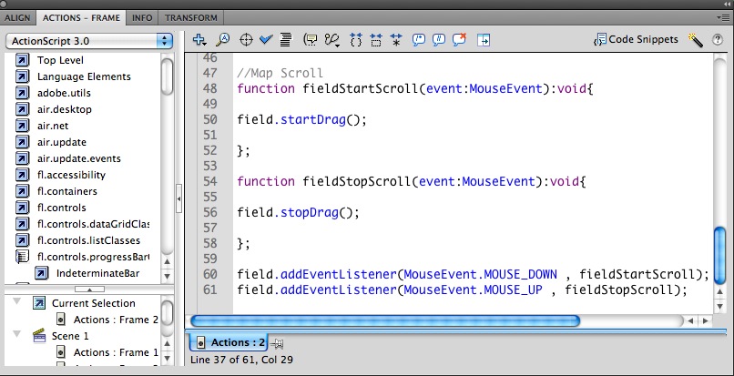
Now that we are able to zoom in the field map it is interesting to enable the possibility to scroll the screen in order to be able to move the screen across the map. And once we have defined the properties of the field image, we can just assign to it a Drag&Drop action to simulate the screen scroll.
1. Open the Actions panel associated to the second frame of the Actions layer, and write the following code in the Script window.
You can optimize the usage of your screen including hidden information that will appear on a concrete event. This is what we know as a Pop-up element. In this section we will implement a Pop-up menu containing different elements that will be shown in the screen as we move the cursor over a button included in the field map.
1. First, we are going to create the button that will launch the Pop-up menu.
1.1. Create a new button and set the name as “pop_btn”.
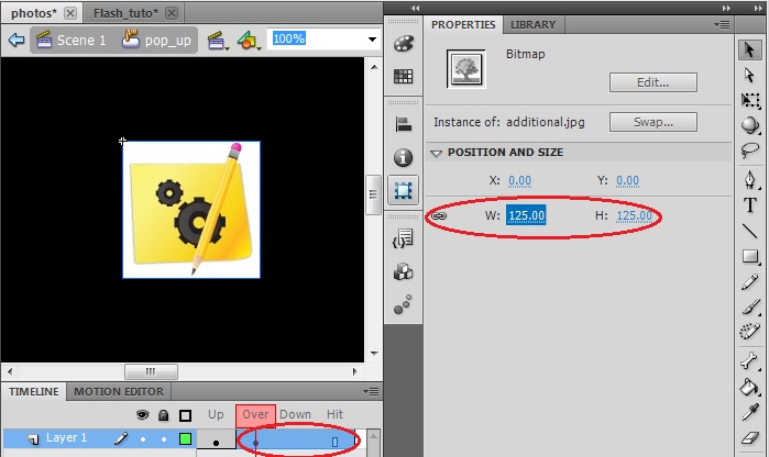
1.2. Drag and drop in the stage the JPG image provided with this tutorial, “additional.jpg”. The image will be included in the “Up” state of the button and the JPG file will be imported to your Library.
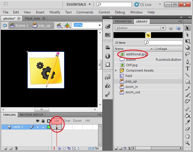
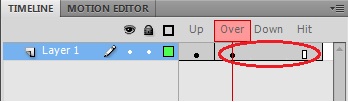
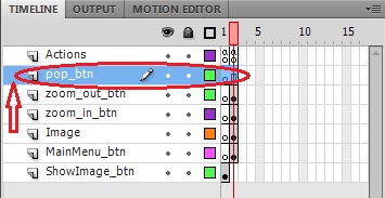
1.3. We are going to create a slightly different representation of the button for the other states in order to indicate that the user is activating this element. Insert a Keyframe in the “Over” state and insert a Frame in the other two states.
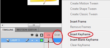
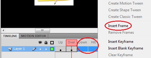
Note: This way the representation of the button configured in the “Over” state will be the same for the following selected frames.
1.4. To differentiate between states we are simply going to change the size of the button. Select the image from the stage, select the Properties tab and set its dimensions slightly smaller.
1.5. Create the new layer that will contain this button. You should take into account that you must place this layer above the layer containing the field image in order to be shown in screen over the field map.
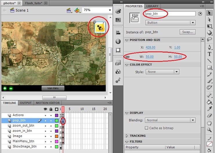
1.6. Insert a Keyframe in the second frame, drag&drop the pop_btn from your library to the stage and place it in the top-right corner of the screen. You will notice that the image may be too big, so set its dimensions to 50 pixels. And don’t forget to set its Instance Name to be able to make reference to it from the Action Script, use “pop_btn” as name.
Note: This last minute change in the size of the button won’t interfere with the size change of the button for different states; it will still change to a smaller dimension on mouse over.
2. Now, we are going to create the Pop-up menu that will appear as the user activates the button that we just have designed.
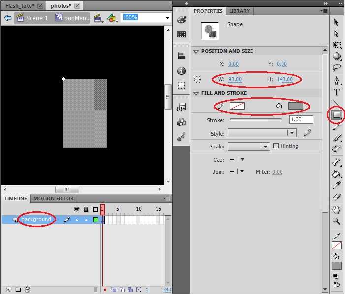
2.1. Create a new symbol and set the name as “popMenu” and the Type as Movie Clip.
2.2. In this step we are going to create the menu’s background. Select the Rectangle Tool, set the Stroke and Fill colors and draw a rectangle in the stage. A good dimension according to the screen size could be width=90 pixels and height=140 pixels.
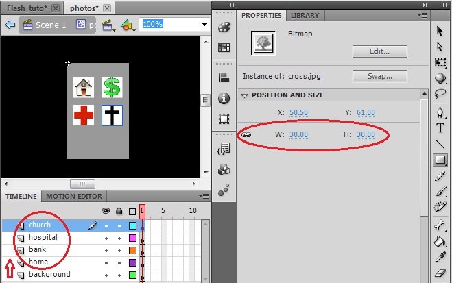
2.3 Now we are going to insert the different elements of the menu. Drag and drop in the stage the JPG images provided with this tutorial: “Home.jpg”, ”Green dollar Icon.jpg”,” redCross.jpg” and “cross.jpg”. In order to maintain a good structure in our application it’s a good procedure to create a new layer for each element included, taking into account that all of them have to be above the background layer in the layers’ stack. And set the dimension of each element to 30x30 to fit properly into the menu.
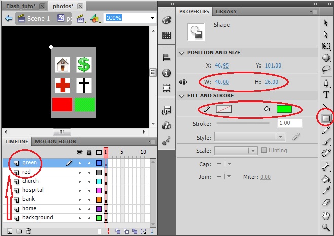
2.4 Finally, we are going to create two additional elements into the menu, a red and a green rectangle to indicate for example a terrain with good or bad substrate. Use the Rectangle Tool to draw them in different layers setting properly the Stoke and Fill colors as well as their dimensions.
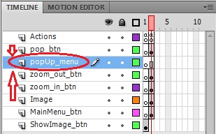
2.5 Create the new layer that will contain this button. You should take into account that you must place this layer above the layer containing the field image in order to be shown in screen over the field map and under the layer containing the pop_btn to simulate that the menu emerges from the button.
2.6. Insert a Keyframe in the second frame, drag&drop the popMenu from your library to the stage and place it in the top-right corner of the screen. . And don’t forget to set its Instance Name to be able to make reference to it from the Action Script, use “popMenu” as name.

3. Once we have created these two elements we just need to configure the Actions script in order to implement the pop-up action.
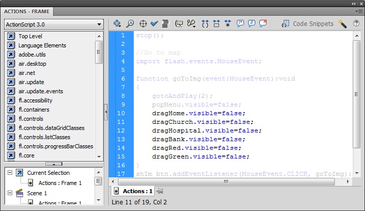
3.1 By default every element that we include into the stage is visible. But we can change the visibility parameter of a certain element to hide it or make it appear. Include the following line in the Actions script of the first frame to hide the pop-up menu each time that we go to the second frame.
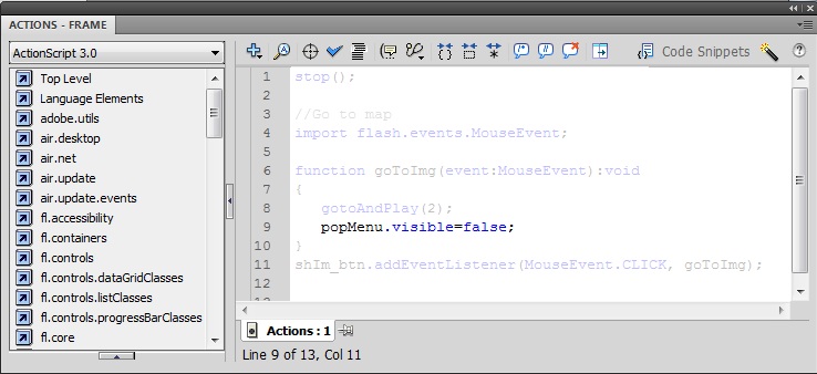
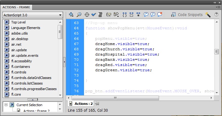
3.2. Finally, in order to simulate the pop-up effect we can simply set the pop Menu visible on a mouse over event associated with the pop button. Include the following lines in the Actions script of the second frame and your pop-up element will be ready to use.
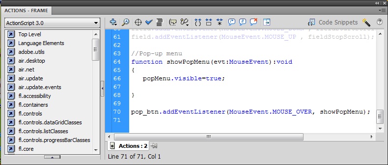
Note: We have not configured yet the action to hide again the pop-up menu, but we will do it in next section in combination with a new feature.
In this section we are going to illustrate an example of a Drag&Drop action where the elements contained in the pop-up menu are going to be used to indicate certain locations in the field map.
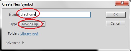
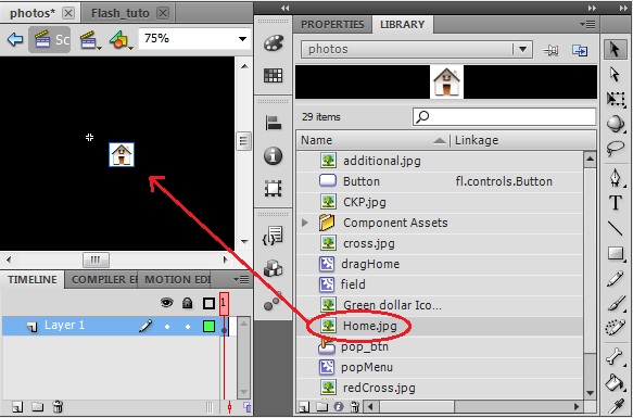
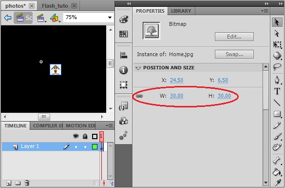
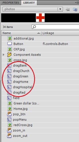
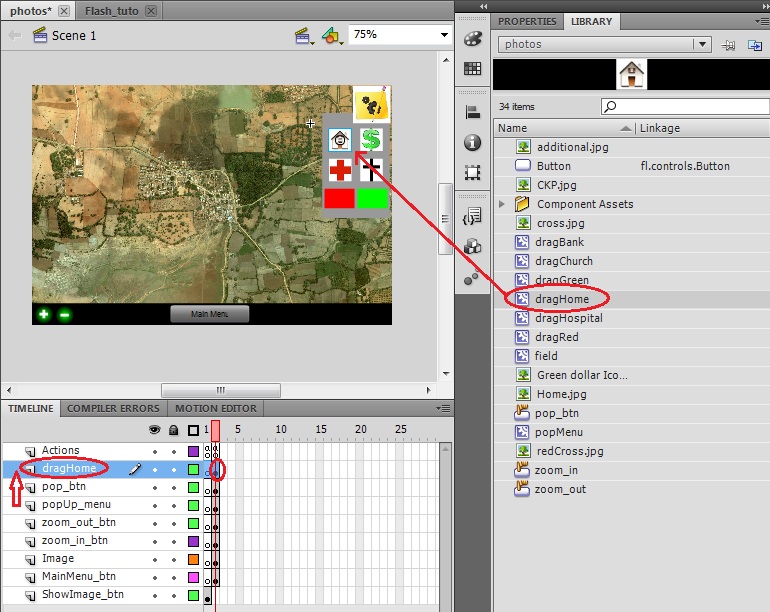
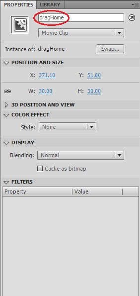
1. In fact the objects that we are going to drag&drop are not exactly the elements contained in the menu but a copy of them. Thus, we need to create new Symbols in our Library as a copy of the original ones. Create a new symbol and set the name as “dragHome” and the Type as Movie Clip. Drag&drop the Home.jpg image from your library to the stage and set its dimensions to be equal to the corresponding element in the pop-up menu.
2. Repeat the last step for the rest of the elements contained in pop-up menu.
3. Insert these new elements into the stage overlapping them with the original elements from the pop-up menu. To do so, create a new layer for each of them placed above the pop-up menu layer, insert a Keyframe in the second frame, place the elements in the correct position and set the Instance name of each of them.
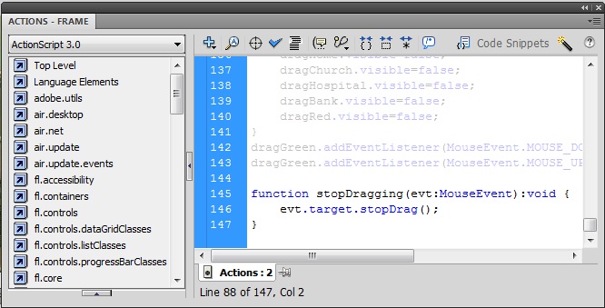
4. Now that we have prepared all the elements of the pop-up menu to be dragged, we need to configure the Action script to implement the desired action. Once the drag action has started we should hide again the pop-up menu to increase the usage of the screen, but we have just superimposed over the pop-up menu the objects that we are actually going to drag. Thus, each time that we start the drag action of a certain element we need to change the visibility of the pop-up menu as well as the visibility of all the other elements that have not been dragged yet. To do this you just have to reproduce the code below for each of the elements in the Action script of the second frame. The creation of the variables that monitor whether an element has been dragged or not just need to be included in the code once.
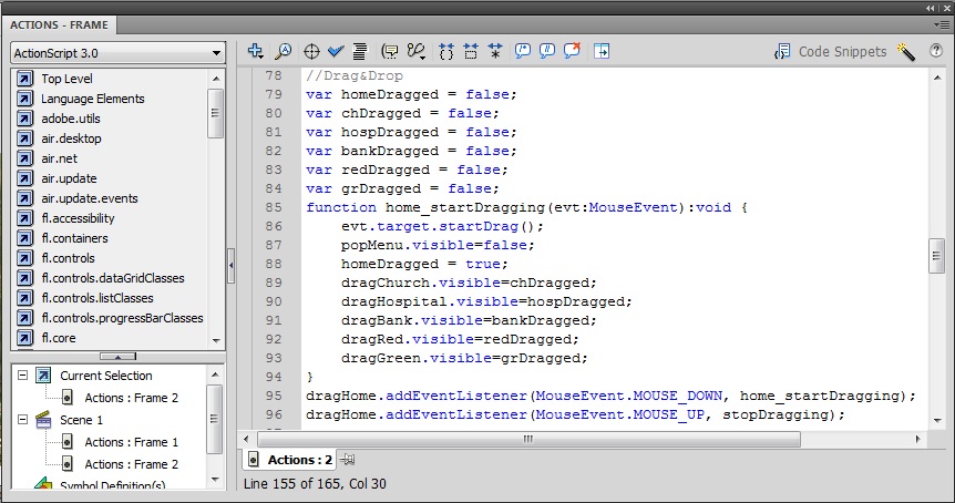
5. The stopDragging method can be constructed being generic for all the elements because we don’t need to change the visibility of any element and we can act directly in the element which has launched the event (evt.target). Insert the following code in the Action script of the second frame.
6. Finally, we just need to take into account that all these elements need to be hidden until the pop-up menu appears. Thus, we need to modify the Action scrip of the first frame to hide the elements each time that we enter in the second frame. Insert the following code lines in the Action scrip of the first frame.
And also insert in the Action scrip of the second frame the code lines below to make them appear over the pop-up menu each time that it is displayed.
10. Modifying the objects’ transparency
It could be interesting to modify the transparency level of the objects to be able to distinguish what is behind them. For example, in our field map it could be interesting to see across the red and green dragging objects (bad and good substrates) to check how is the terrain laying behind these symbols.
1. Select the dragRed element, click in the Properties tab, set as Color Effect Style: Alpha and set the alpha level to 50%.
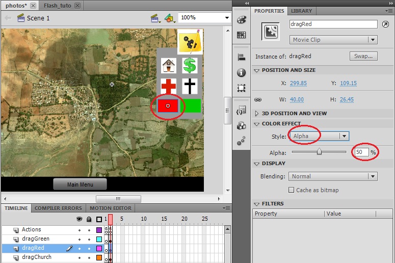
2. Repeat the last step for the dragGreen element.
3. Now your application should look like this:
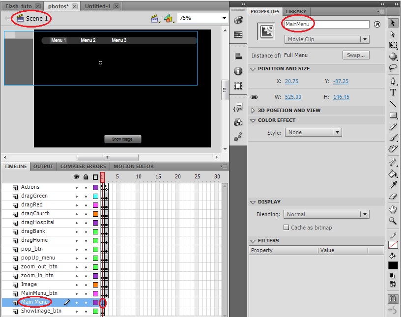
It’s common in many applications to have a main menu as starting point where you have access to the different components of your application. In this section we are going to illustrate how to include a main menu in our application using one of the examples that the Adobe Flash library provides us.
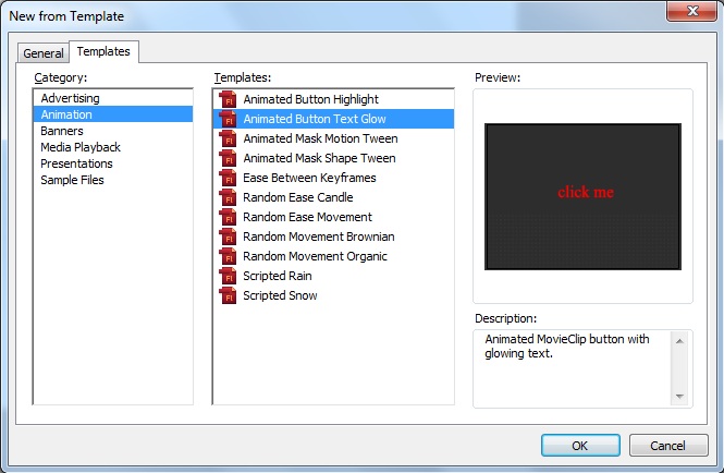
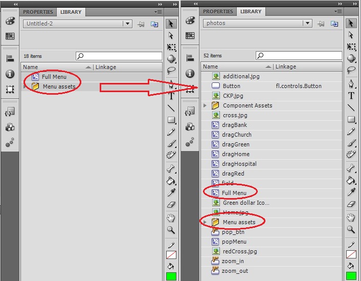
1. Clink on File->New… and select the Templates tab on the menu, the Sample Files category and the Menu Sample Template. Click OK to create a new file that contains this Menu Sample.
2. We are going to directly include in our application this menu as it is given and later we will modify it from there. Copy all the elements from the Library of the new Menu sample file and copy them into ours application’s Library.
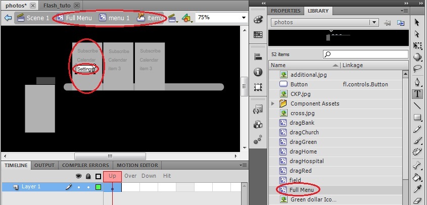
3. Double click in the Full Menu object from our library, choose the Selection Tool and double click in the grey box corresponding to menu1. Once we are in the menu 1 stage double click in one of its items and change its generic name for another more meaningful for our application. Change the names “item 1”, “item 2” and “item 3” by “Subscribe”, “Calendar” and “Settings”.
4. Go back to the main scene by clicking in Scene 1, create a new layer for the Main Menu, insert a Key frame in the first frame, drag&drop the menu from the library to the stage and set its instance name ad “MainMenu”.
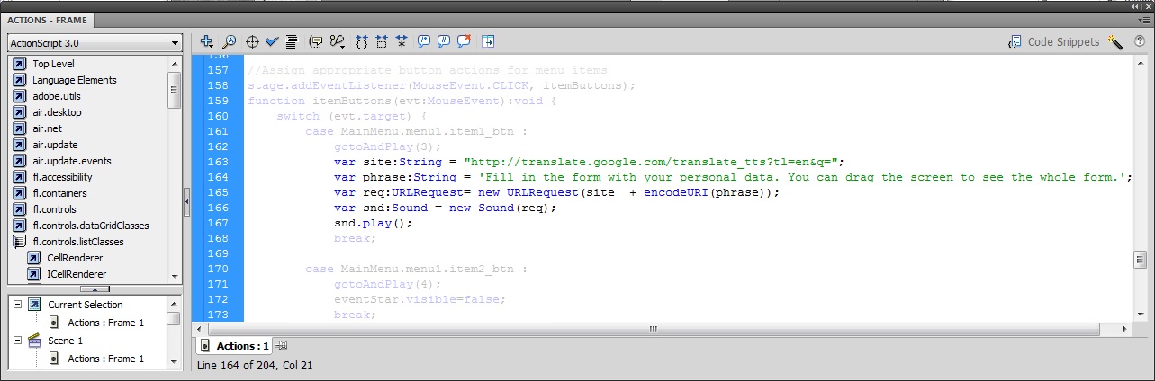
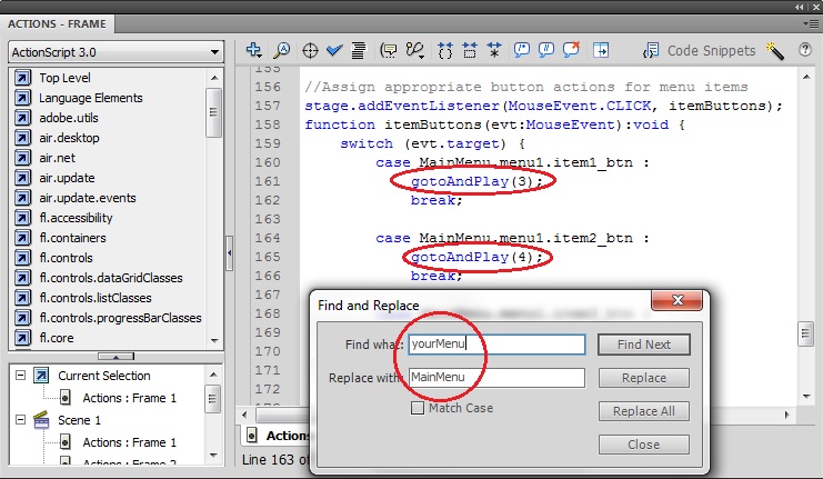
5. Finally, we just have to include this code into the action script of our application’s first frame and modify it according to our needs. Paste the code into the action script of the first frame, search for the last section code where the actions are assigned to the menu items (//Assign appropriate button actions for menu items) and modify the code to change to the third frame when the first item is pressed and to the fourth when the second one is pressed. (The final code section is shown below).
Another common element in many applications is a form to be filled by the user. In this section we are going to create a form where we will include several elements.
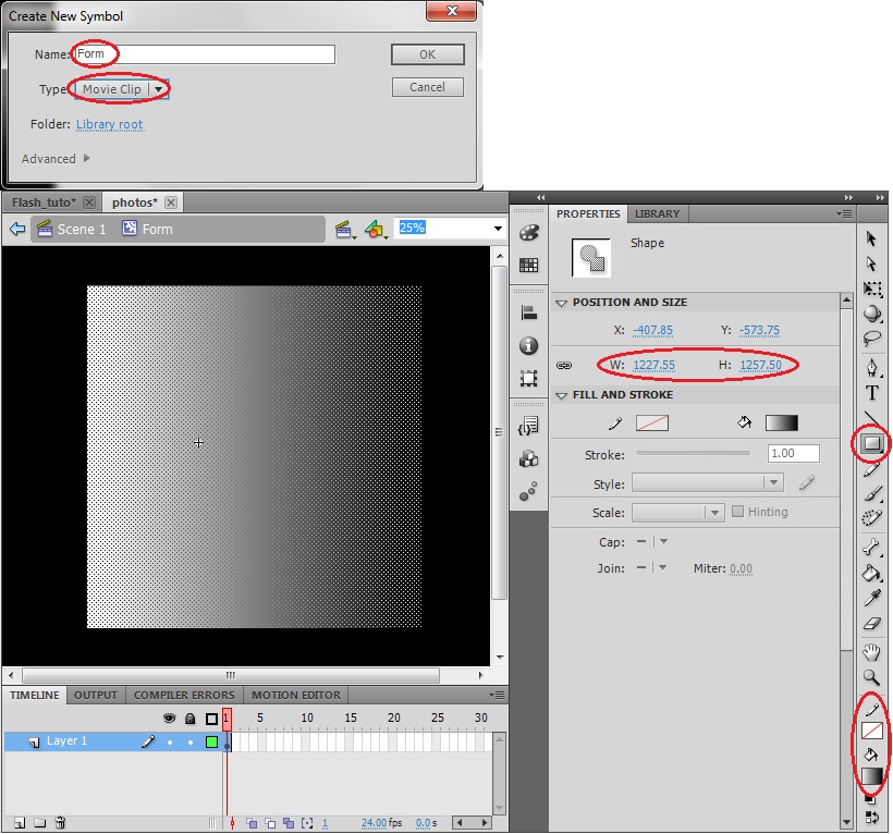
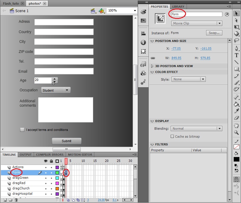
1. Create a new symbol and set the name as “Form” and the Type as Movie Clip and create a big rectangle as the background of the Form menu.
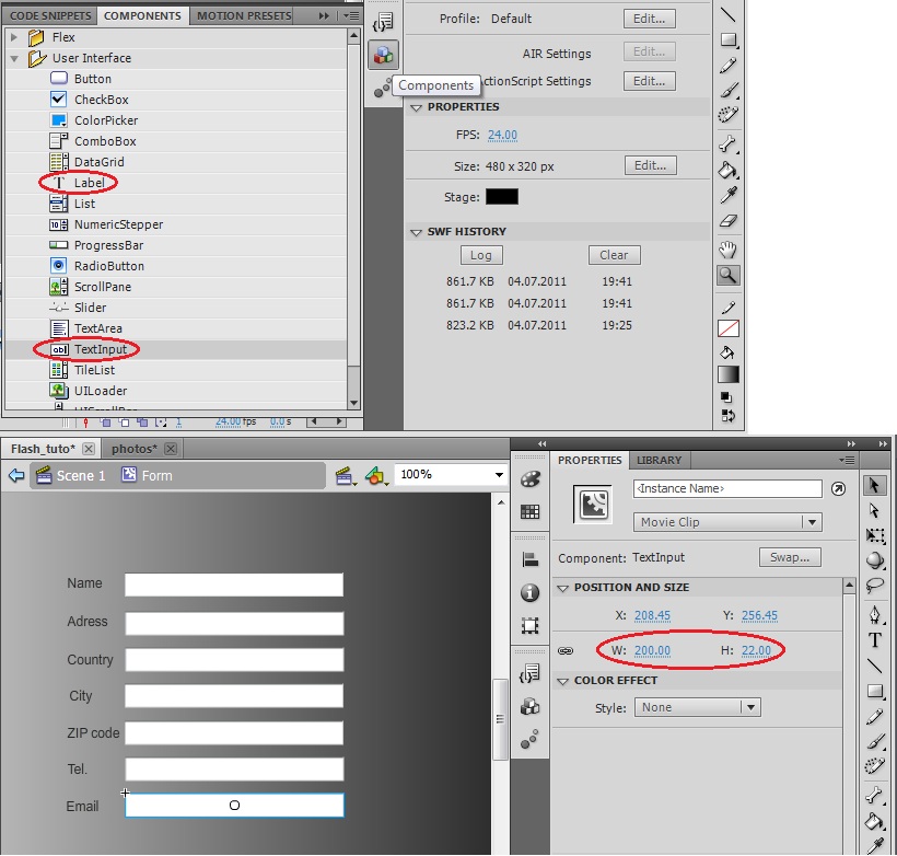
2. First, we are going to insert some text fields to entry some personal data. Select from the Components menu a TextInput component, drag&drop it into the stage over the background rectangle and adjust its dimension. Do the same with a Label component to include some explanatory text in front of the TextInput. The final result should be something similar to what it’s shown below.
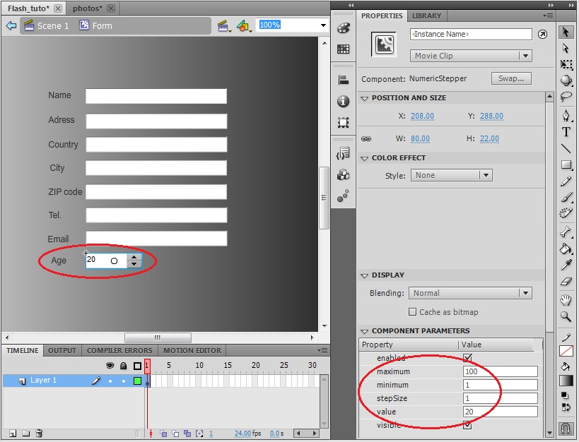
3. Let’s add some different elements to our form. In order to select the age of the user it is common to use a numeric stepper. Select from the Components menu a NumericStepper component and drag&drop it into the stage over the background rectangle and below the text fields. Do the same with a Label component to include some explanatory text in front of the NumericStepper. This component has some parameters than can be configured easily. Go to the component parameters and set the values according to its functionality (i.e. a field to specify the age): minimum=1, maximum=100, stepSize=1 and value=20 (the initial one).
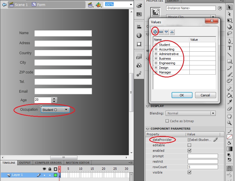
4. In order to specify a certain parameter of the form that must be constrained among a finite number of options it is common to use a combo box. Select from the Components menu a ComboBox component and drag&drop it into the stage over the background rectangle and below the NumericStepper. Do the same with a Label component to include some explanatory text in front of it. For this component we need to specify the different options of the list, thus open the data provider from the component parameters and include the following options by clicking the plus symbol and specifying the label.
5. In order to accept or decline certain assertion it is common to use a check box. Select from the Components menu a CheckBox component and drag&drop it into the stage over the background rectangle and below the ComboBox. Do the same with a Label component to include some explanatory text in front of it. For this component we just need to specify the label, thus set the label from the component parameters with the following text: “I accept terms and conditions”.
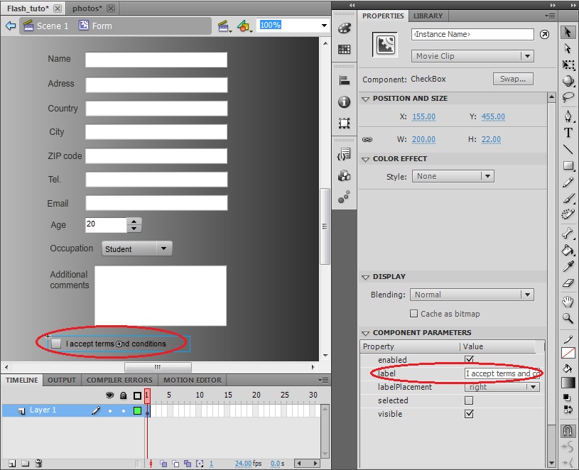
Note: We have included an additional text input to make the form more complete.
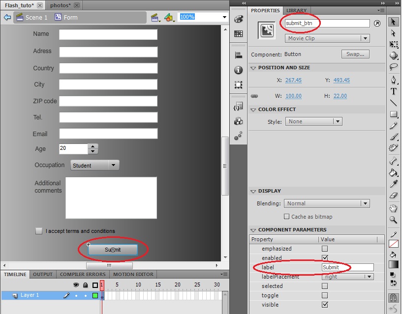
6. Finally, we should include a button to be able to go back from the form to the main menu. Select the Button from you library and drag&drop it into the stage at the end of the form. Set the Label and also its Instance Name because we are going to implement an action associated to it.
7. Now we are going to include this form in our application. Create a new layer, insert a Key Frame in the third frame, drag&drop the form that we just have created from the library to the stage and set its Instance Name as “form”.
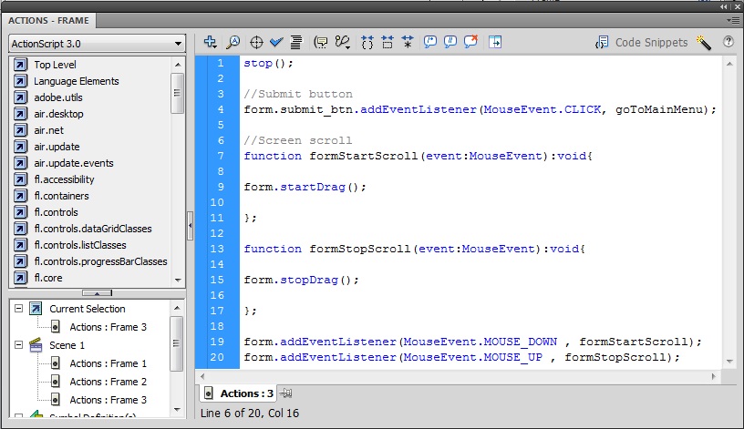
8. As final step we are going to configure the actions associated to this frame. Insert a Key Frame in the third frame of the Actions layer, open its Action script and place the following code to: stop the application when accessing to the frame, configure the action associated to the button in order to return to the main menu and enable a screen scroll in the same way as we did for the field map because the form is bigger than the screen.
Note: The way to access to an instance created within another one is: containerElement.elementToBeReferenced
13. Create an interactive calendar (it includes buttons over an image’s region and radio buttons)
Another common feature in many applications is an interactive menu where the user can select a day, configure some parameters for this day and then it will be marked in the calendar.
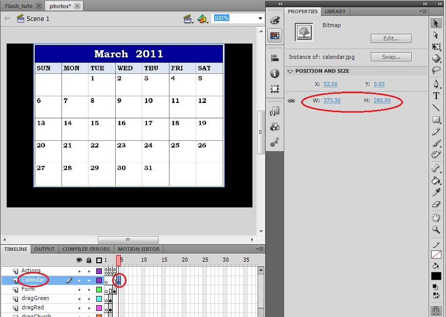
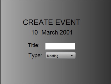
1. Create a new layer for the calendar image, insert a Key Frame in the fourth frame, drag&drop into the stage the JPG image provided with this tutorial, “calendar.jpg”, and configure its dimensions to fit into the screen leaving some free space in the bottom because later we will place a button there.
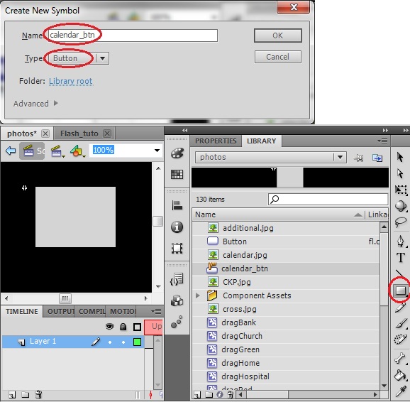
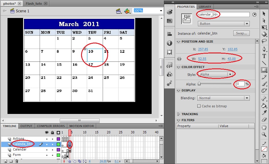
2. In this step we are going to create a hidden button over a day in the calendar in such a way that when the user makes click in the calendar image in the region of a certain day, what he/she is really doing is clicking this button. Create a new symbol and set the name as “calendar_btn” and the Type as Button and create a rectangle as the button.
3. Once back into the main scene create a new layer, insert a Key Frame into the fourth frame, drag&drop the calendar_btn from the library into the stage, set its instance name, set its dimensions to fit in the area corresponding to one day, center it in the correct position and change its color effect’s style to alpha and this value to 0%.
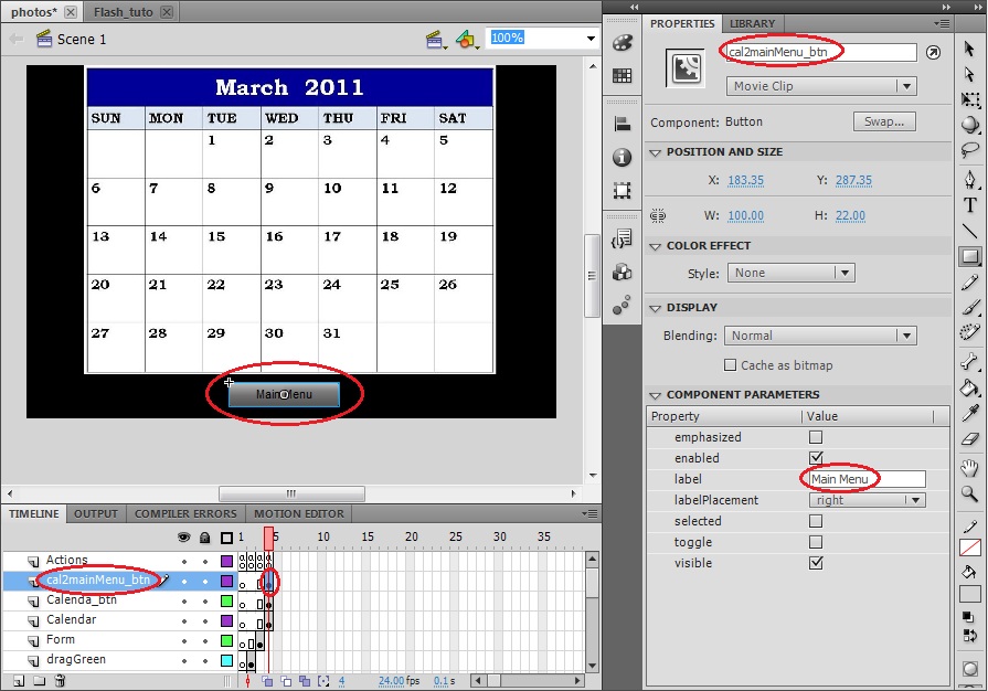
4. We also need to include a button to be able to go back to the main menu. Create a new layer, insert a Keyframe into the fourth frame, drag&drop the Button from the library into the stage, set its instance name, place it in a correct position and set its label as “Main Menu”.
5. We need to configure the actions associated to this buttons to move to the correct frame when they are pressed. To do so, insert a Keyframe into the fourth frame of the Actions layer and insert the following code to its action script.
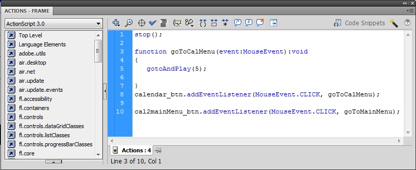
Note: We will place the calendar menu associated to this day in the fifth frame.
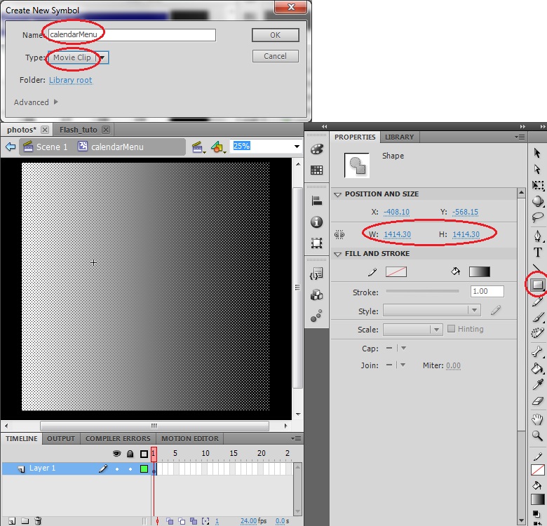
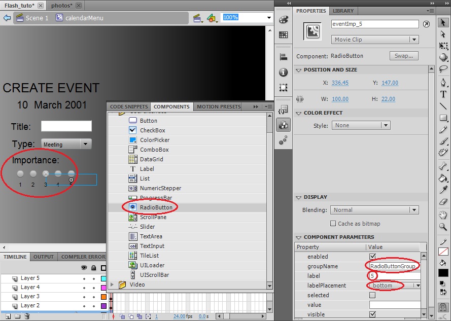
6. Our next step is to create the menu to configure the parameters associated with the selected day, for our example application we will create an event of a certain type and importance. Create a new symbol and set the name as “calendarMenu” and the Type as Movie Clip and create a big rectangle as the background of the Form menu.
7. This menu will contain a TextInput to set the event’s name a ComboBox to select the event’s type and some Labels with explanatory text. Follow the procedure explained in the Form creation to create a menu as the one shown below.
8. Another interesting element appearing in a lot of applications is the Radio Button. A group composed out of several instances of this element enables the possibility to exclusively select one of them by automatically deselecting the previous selection.
In this step we are going to configure a group of Radio Buttons to indicate the importance level of the event. Select from the Components menu a RadioButton component, drag&drop it into the stage over the background rectangle, set its label as “1” and set labelPlacement as bottom. Note that within the component parameters we have a groupName property; this parameter is the one responsible of the configuration the Radio Buttons group, thus we just have to assign the same groupName for all the Radio Buttons elements that we are going to create. By default all the Radio Buttons will have the same groupName: “RadioButtonGroup”.
Finally, drag&drop from your library the RadioButton element four more times increasing the label numeration one by one and also add a Label with explanatory text. You can check below the menu’s aspect.
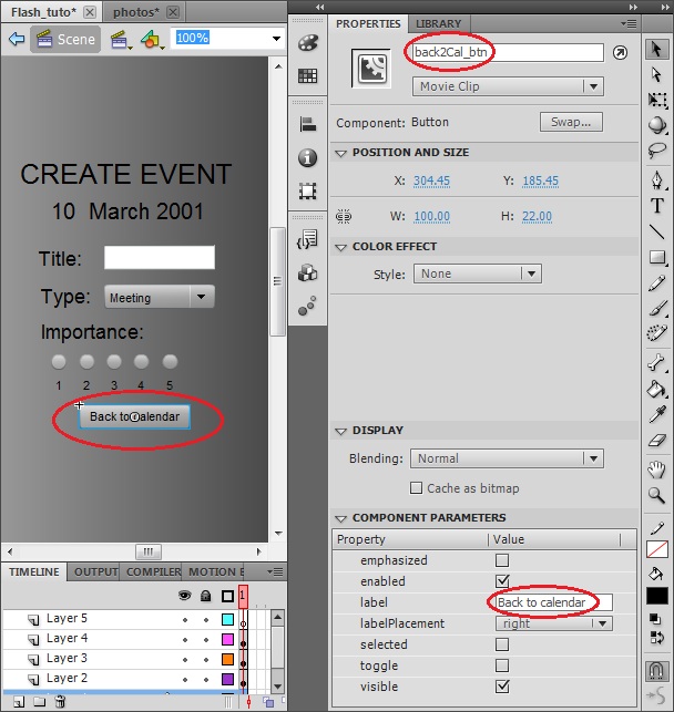
9. The last thing that we need to include in the menu is a button to go back to the calendar. Select the Button from you library and drag&drop it into the stage at the end of the menu. Set the Label and also its Instance Name because we are going to implement an action associated to it.
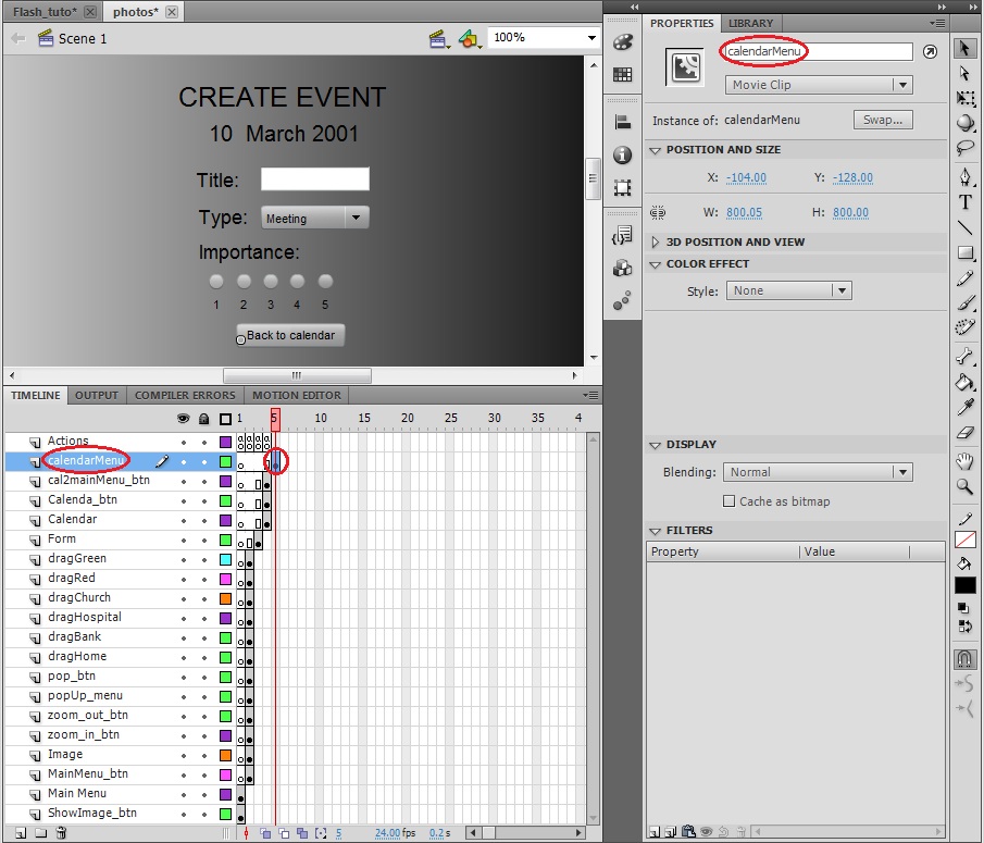
10. Now we are going to include this menu in our application. Create a new layer, insert a Key Frame in the fifth frame, drag&drop the menu that we just have created from the library to the stage and set its Instance Name as “calendarMenu”.
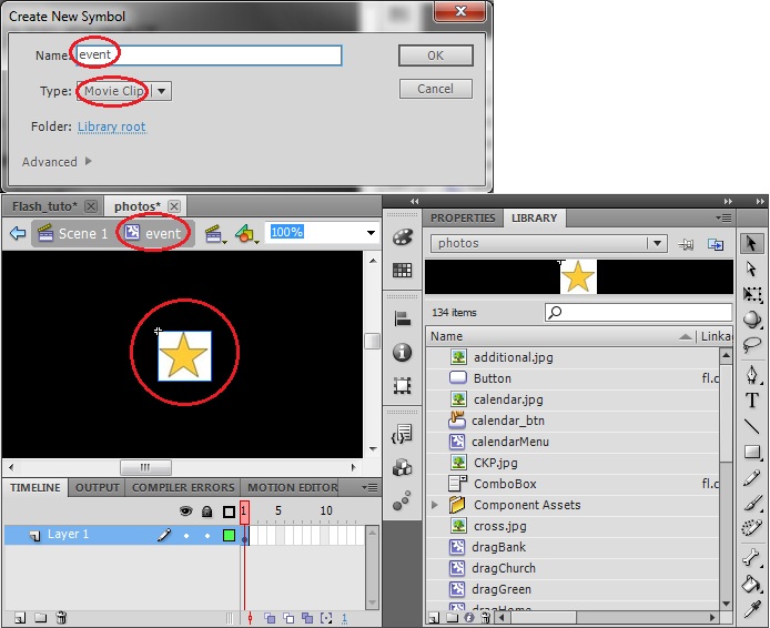
11. The final step to complete our interactive calendar is to add some element in the calendar to indicate that an event has been created in a certain day. Create a new symbol and set the name as “event” and the Type as Movie Clip and drag&drop in the stage the JPG images provided with this tutorial: “GoldStar.jpg”.
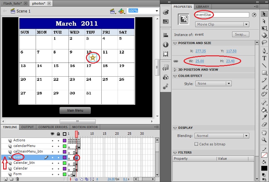
12. Now we are going to include this element in our application; we will place it directly over the calendar and later we will play with its visibility. Create a new layer above the calendar and the calendar_btn layers, insert a Key Frame in the fourth frame, drag&drop the element that we just have created from the library to the stage in the same area where we have placed the calendar_btn, reduce its dimension to fit properly and set its Instance Name as “event”.
13. Finally, we just need to take into account that this element needs to be hidden until an event has been created. Thus, we need to modify the Action scrip of the first frame to hide the elements each time that we enter in the fourth frame. Insert the following code line in the Action scrip of the first frame.
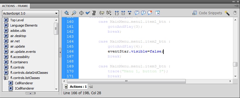
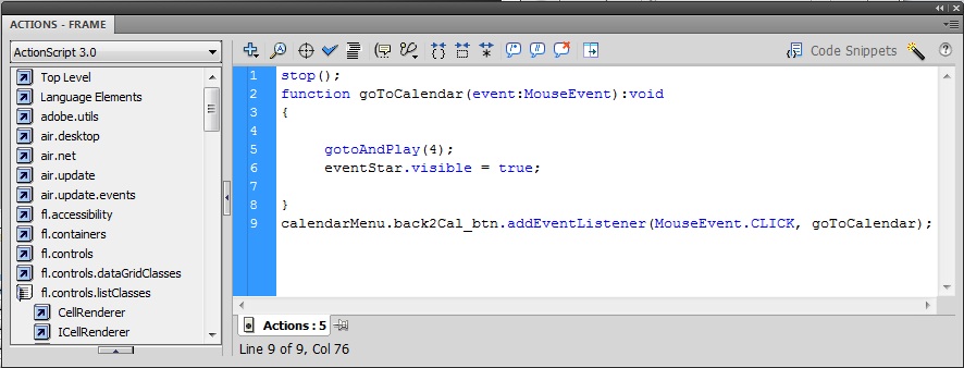
And also we need to make it appear once the event has been created. Insert a Keyframe in the fifth frame of the Actions layer and insert in its Action scrip the code lines shown below. It will make it appear and also it will configure the action associated to the button in order to return to the calendar.
As a final step of this tutorial we will illustrate how to include a more advanced feature into our application, we are going to convert a written text into an audible speech signal.
One of the week points of our application is that it is not very clear the possibility to scroll the screen in the subscribe form. We could include some symbol, but we are going to reproduce the voice of someone explaining that we must fill the complete form and that we can drag the form to scroll the screen.
1. A way to implement this feature is to perform a request to google translate site to execute its text to speech tool with the text that we want to reproduce. We will catch its response and we will create a Sound variable that will be played when the user enters in the subscribe form. Open the Actions panel associated to the first frame of the Actions layer and write the following code in the Script window.